Decide What to Capture:
Besides capturing an overall image of your product, you want to make sure your photos are extremely clear, and accurately convey your product's quality, color, texture, construction, size, etc. Imagine you are shopping in a physical store location, and you see one of your products on the shelf. How will you examine it and what will you want to look at? For example, if it's a bracelet, will you put it on to see how it hangs on your wrist? Then take a photo of it on a wrist. Will you look at the clasp to see how it attaches? Take a close-up of the clasp. The more details you can show, the better!
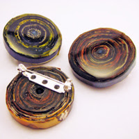
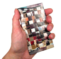
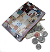
Here are a few examples of photos I've taken for my Junk Mail Gems site, highlighting different product aspects:


I do edit many of my product shots in Photoshop, often taking out the background completely so they are on white (like the coin purse and wallet above). You may also want to experiment with other nice backgrounds and props, like sand, grass, wood, velvet, or whatever else might fit within the realm of the products you are photographing. I always try to include something that helps show the scale of the product, when scale matters. Things like the coins, hands, fruit, and hardware details help convey scale too.
Camera
You'll obviously need a decent camera. While you can spend hundreds or even thousands of dollars on equipment, I have found that for the purposes of shooting my product photography in my limited budget, my day-to-day digital point-and-shoot works just fine. I set the lighting to match the type of light I am using, put it on macro mode, and in my gorilla pod to keep it steady. If I really want to keep it super steady, I will set it to take a photo automatically after a 10 second delay, so my hands are not even touching the camera when the photo snaps.

If you're using a digital point-and-shoot like me (I know, I know, you professional photographers are cringing now), get to know your light setting options. This photo above shows the difference in the color of the plain white background (on the camera screen) when it's set at "cloudy" versus "incandescent" lighting on my camera. You'll want to set it to match your light settings as best you can, so that the image on the screen most closely resembles reality. I also set mine on the "macro" setting when I'm shooting something small and close-up, to get the best detail and make sure everything is in focus.
Proper Lighting
Lighting and the environment is really the most important thing when it comes to getting clear shots of your product. Harsh lights will create harsh reflections and shadows, both of which hide your product rather than highlight it. Photographing your products outside on an overcast day works great, because the clouds act as a diffuser for the light. However, you can't always rely on the weather, and if you're like me and do most of your work at night when the kids are in bed, you can't rely on the sun still being up either. The best way to prevent harsh lights and shadows indoors is to use a light box or light tent to diffuse the light and create a seamless background.
For years I used a simple cardboard box with "windows" of vellum or tissue paper taped to the sides, a piece of paper inside for a backdrop, and my desk lamps pointed at it. This really did work great for so many of my small product shots. All of the photos taken in the above examples were done in a cardboard box. I was going to put together a tutorial for you to build your own, however, Darren Rowse has already posted a really great one online, here. Mine looked almost identical to his:
If I had seen this earlier I would have tried fabric instead of tissue paper and had something a little more sturdy! This site has another similar tutorial using a cardboard box. You really don't need to buy any big, fancy equipment to greatly improve your photos!!
Once my little boy got bigger, I found myself re-making my mini photo studio because he would get his hands on it and rip it. Recently I came across this great little set on Amazon
My only complaint with this product was that the back drop only had a gray and a blue side, and I like to use white for my photos. So, I just taped a piece of paper inside instead:
The reason people like one curved piece of paper like this that spans the back and base, is that it gives you a seamless background, meaning you won't see a back corner running across all of your photos.
So, this is what my current setup looks like. I point lights from the sides and top and find that my desk lamps work just as well, as long as I set my camera's lighting setting accordingly. Depending on the product and what you're trying to capture, you may find that you need to adjust the angle of your lights, or pull them back if they are too bright, etc. Play around with it and do some experimenting...it's the best way to learn!
Make Your Product "Smile!"
If you're married, you probably remember your photographer constantly adjusting things on you while taking your photo...spreading out your train on your dress, positioning your flowers, tilting your head, adjusting your veil...now smile! The same goes for your product shots. Make sure there are no distracting smudges or fingerprints on your shiny jewelry. Look at the background and make sure there is nothing distracting from the product. (My wedding photographer was NOT good...we had background distractions in ALL of our pictures!) If you have a label, make sure it's turned so that the viewer can read it. Don't crop out something that an online shopper may want to see. If you have a chain on a necklace, don't just let it fall in a pile...try arranging it artistically. Little things like this can make a difference!
More Resources:
My sister recently passed on this great post to me from MomsWhoMakeStuff.com. If you scroll to the bottom of the post, there is an excellent video and a bunch of other great links about photographing jewelry and other products, so check 'em out...they really are worth a look and the more you can educate yourself on this topic, the better your products will look on your site!


Love the little lighting studios! Thanks for the post! Take care, Kerri
ReplyDelete